CN
EN

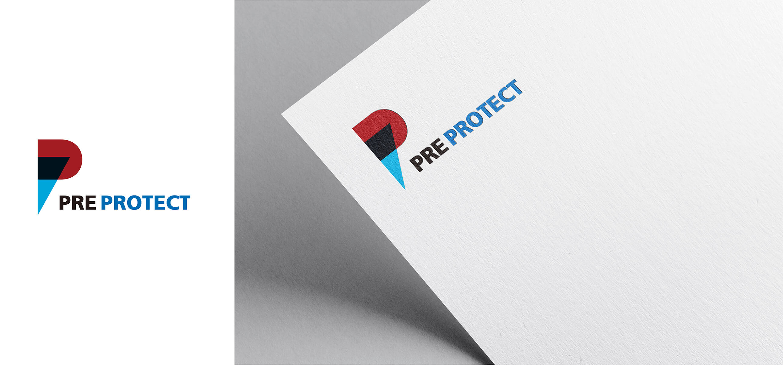
PRE PROTECT
PRE PROTECT is a brand specializing in air purification equipment. The logo is built around the first letter “P” of the brand
name as its primary form, using three vertically arranged color tones transitioning from red to blue to suggest the process of
purification. This color progression reflects the product’s core function, while controlled saturation and contrast create
strong visual impact, enhancing memorability and reinforcing brand recognition.
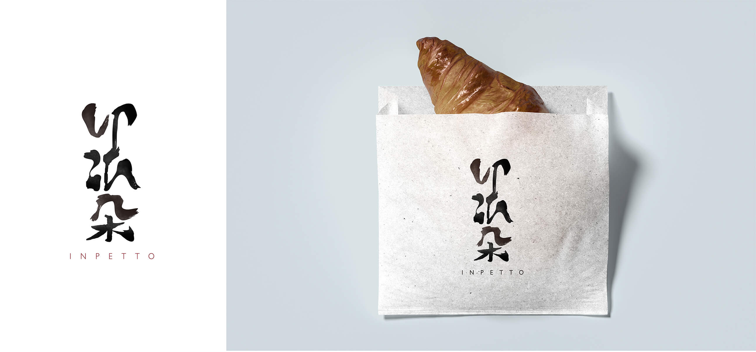
INPETTO
INPETTO is a pastry and bakery brand with an Italian name. To evoke an Eastern cultural atmosphere alongside its
Italian identity, the logo adopts a phonetic Chinese interpretation of the brand name as its core form, rendered in a
calligraphy-inspired style. By combining Italian linguistic meaning with Eastern visual aesthetics, the logo establishes
a distinctive cultural identity with layered visual depth.
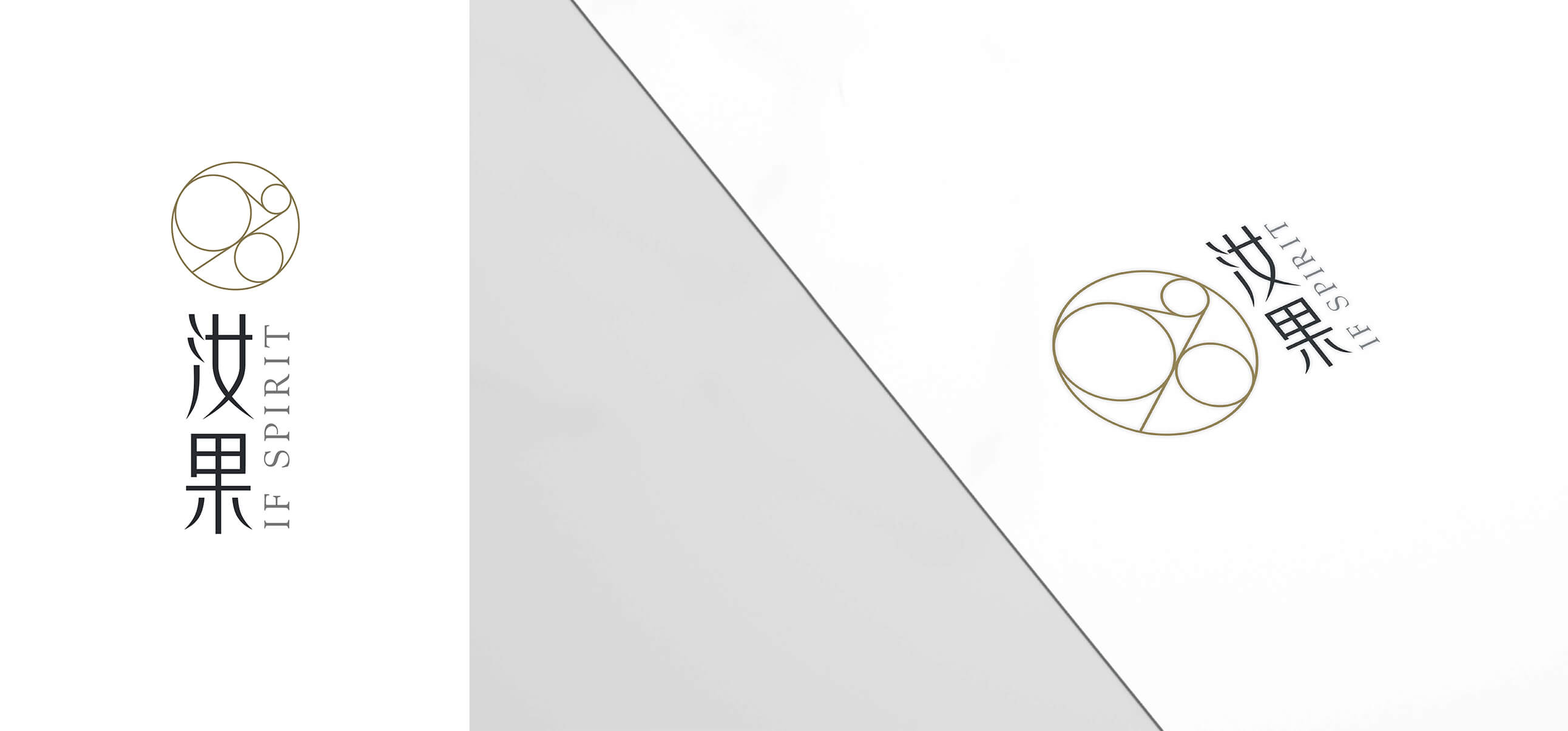
IF SPIRIT
Designed for a pet life ceremony service, the IF SPIRIT logo centers on the circle as its core visual element. An outer circle
encompasses three inner circles of varying sizes, connected by two lines of different lengths, symbolizing the cycle of life,
continuity, and eternal existence. Expressed through refined line work and generous negative space, the logo conveys a
pure, fluid, and contemplative visual quality.
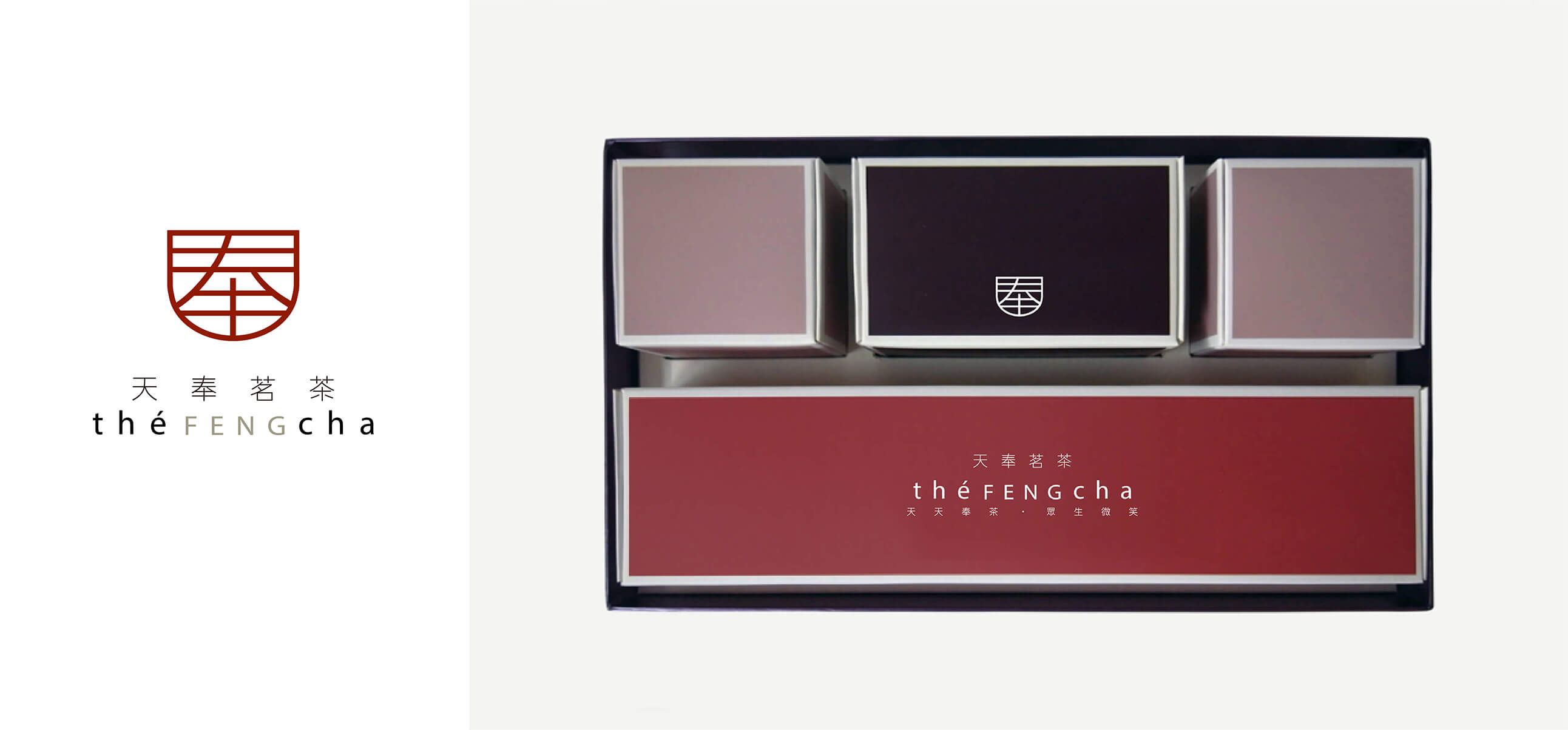
THE FENG CHA
THE FENG CHA is a tea brand whose name signifies “offering tea every day.” The logo concept integrates the form of a
teacup with the Chinese character “奉,” visually connecting the tea industry with the brand’s meaning. Vermilion red is
used as the primary color to convey a strong sense of Eastern culture, resulting in a logo that is both symbolic and culturally
grounded.
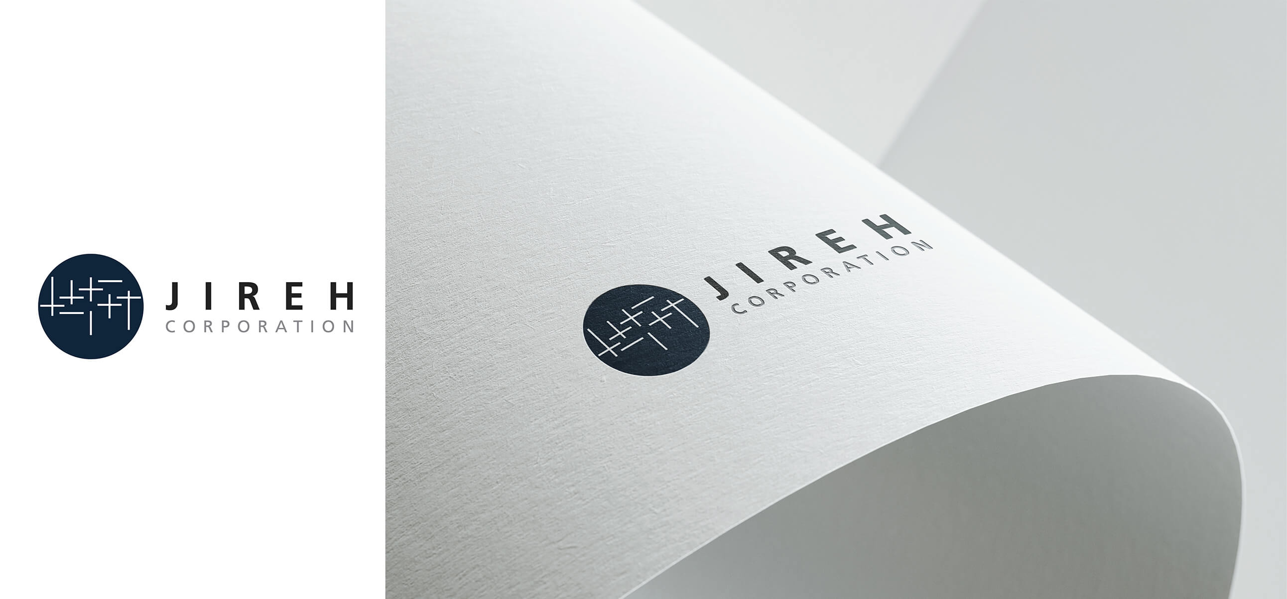
JIREH
JIREH is a company specializing in functional outdoor apparel such as professional jackets. The logo is constructed
using woven linear elements, symbolizing the fundamental nature of the textile industry. The interlacing lines form an
abstract image reminiscent of gazing into the distance or observing the night sky, representing exploration, travel,
and the outdoor spirit aligned with the brand’s positioning.
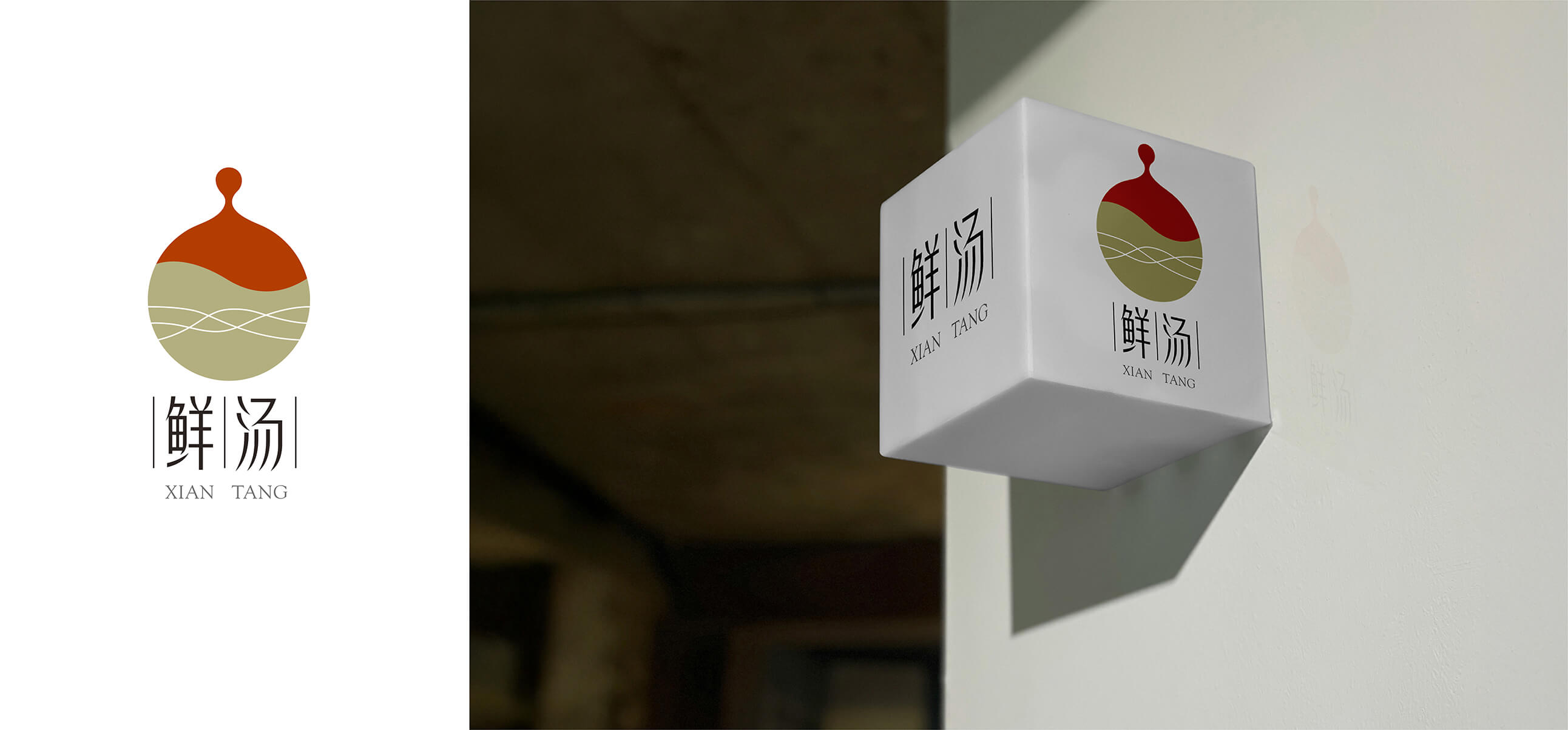
XIAN TANG
For this soup brand, the logo features an upward-extending droplet shape symbolizing the concentrated essence
extracted through the soup-making process. The color scheme is divided into two sections, with vermilion at the
top representing Eastern cultural symbolism and cooking heat, and gold at the bottom signifying the pure essence
preserved through long simmering. Three curved lines further suggest the fluid vitality of the soup, enhancing overall
visual rhythm and movement.